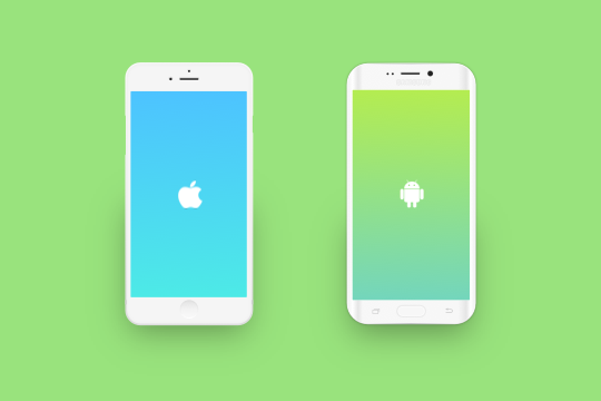


1. Do Not Convert
You shouldn't use the same UI spec to Android.
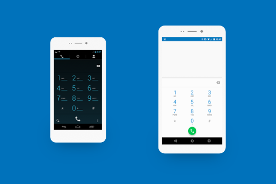
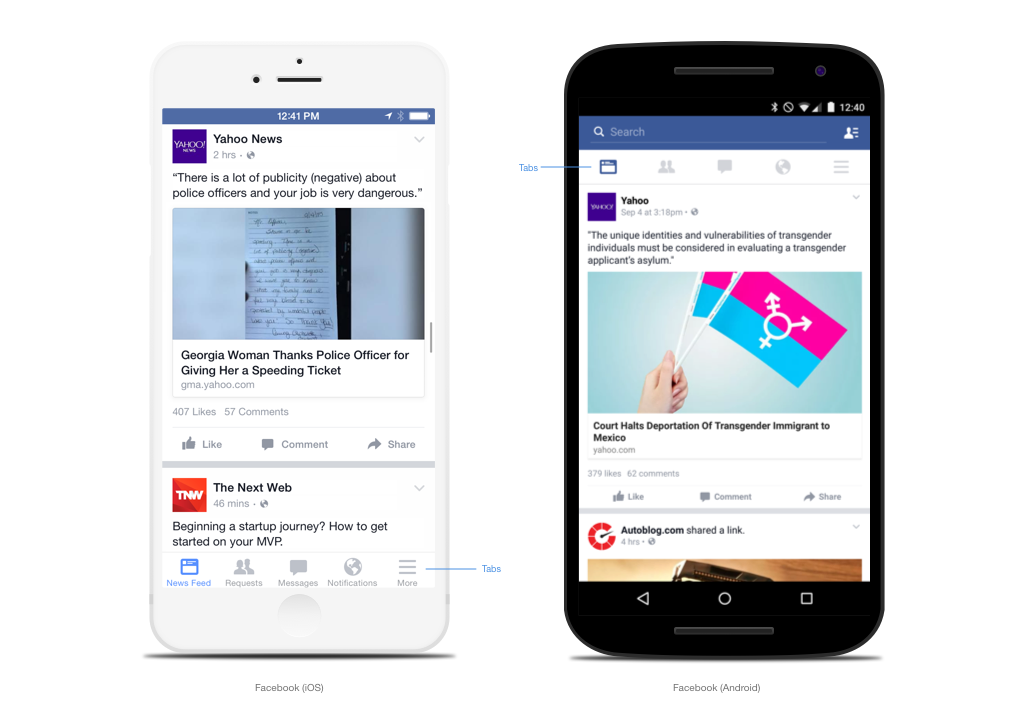
iOS has a "physical home button" that brings you from any screen to home.
However, the Android has "back, home and multi tasking buttons” on the screen.
What does this mean?
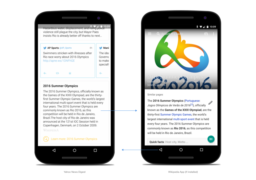
An Android user can browse your app, go to the other app, and come back easily. That makes a huge difference.

For this reason, iOS generally has a mixture of vertical and horizontal UI structures, but the Android is more vertical.

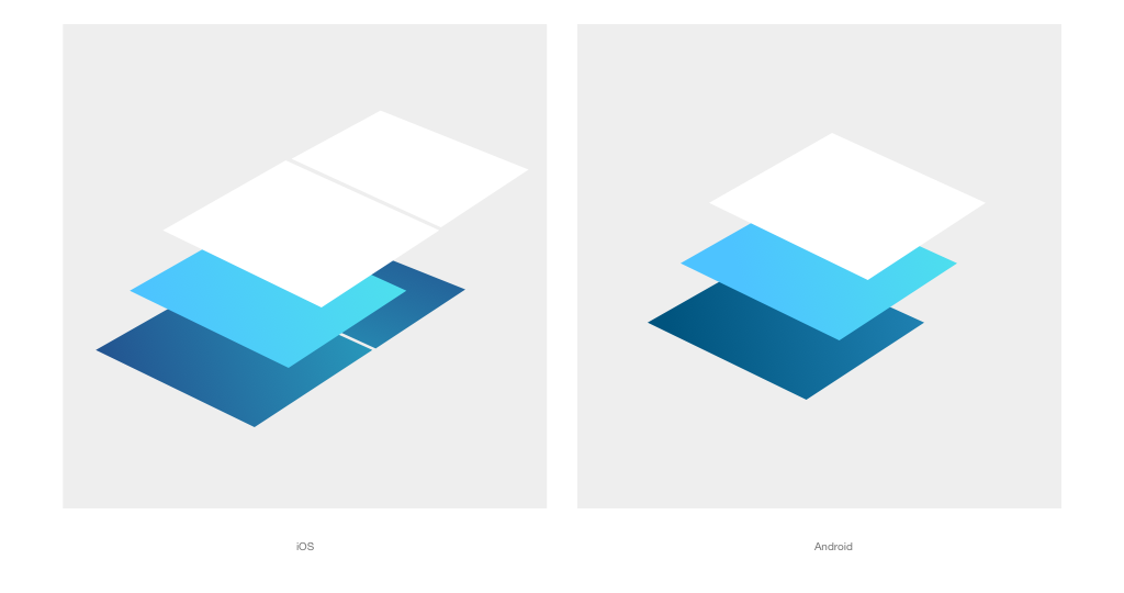
And these “back, home and multi tasking buttons" are on the bottom so you can’t have a tab on the bottom.

2. Familiar with New Terms
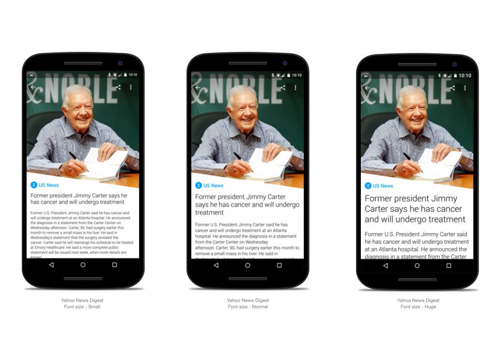
You will often hear the terms “DP", “SP” and "9 Patch".
DP and SP are size units and 9 Patch is the name of the asset format.
DP stands for density independent pixels. It is the absolute unit that never changes in size.
SP is basically the same as DP, but it’s scaleable. If the user set font is huge on device settings, the SP defined font size will be set as huge.

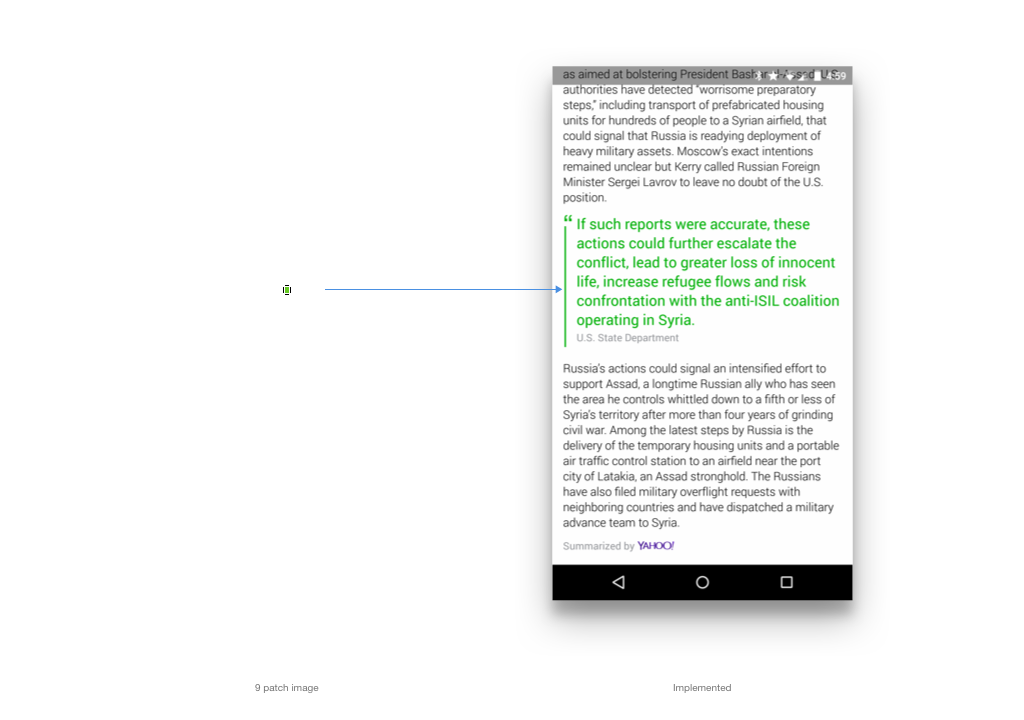
9 Patch is a unique scaleable asset format that dramatically reduces file sizes.
It is typically used in a button with a shadow.
Visit this site to see details:

3. Understand Screen Density and Sizes.
Unlike with the iPhone, hundreds of manufacturers make their own devices.
For example, OpenSignal.com made beautiful, but scary infographics for android fragmentation

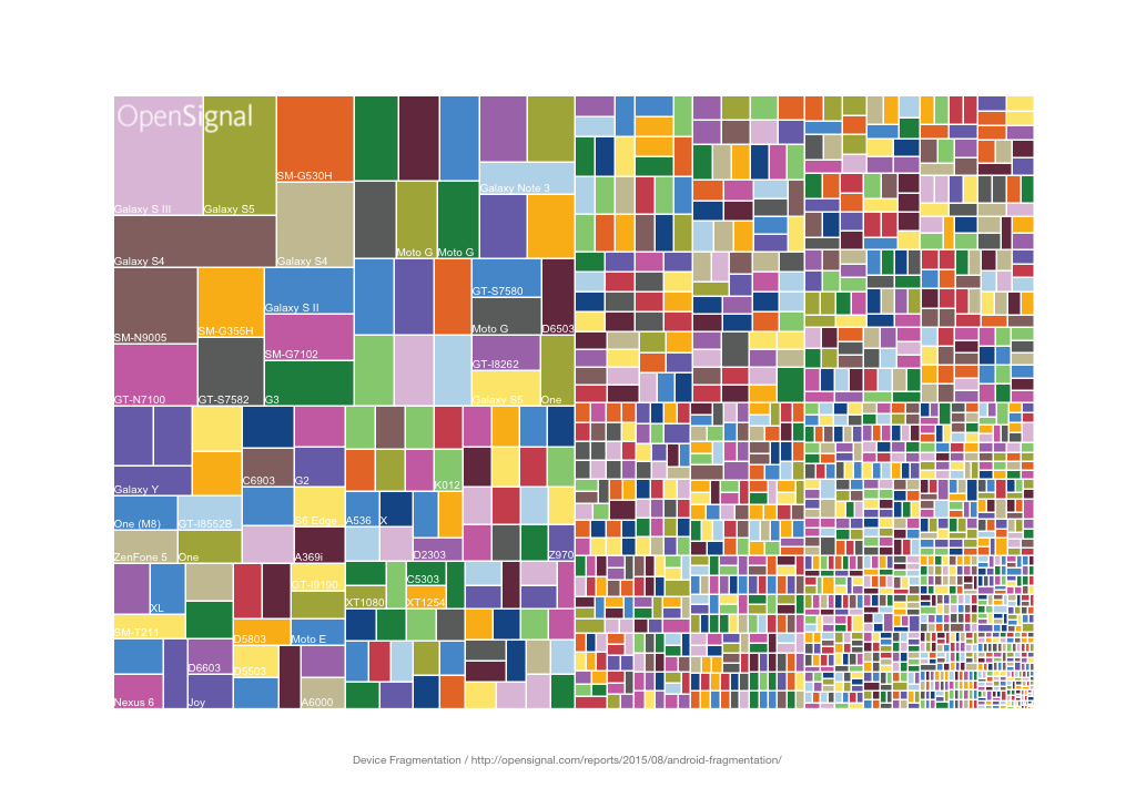
But don’t panic since you don’t have to design for all these cases.
The Android has a screen density system that adapts to each screen size. So you only need to take care of five to seven different sizes.

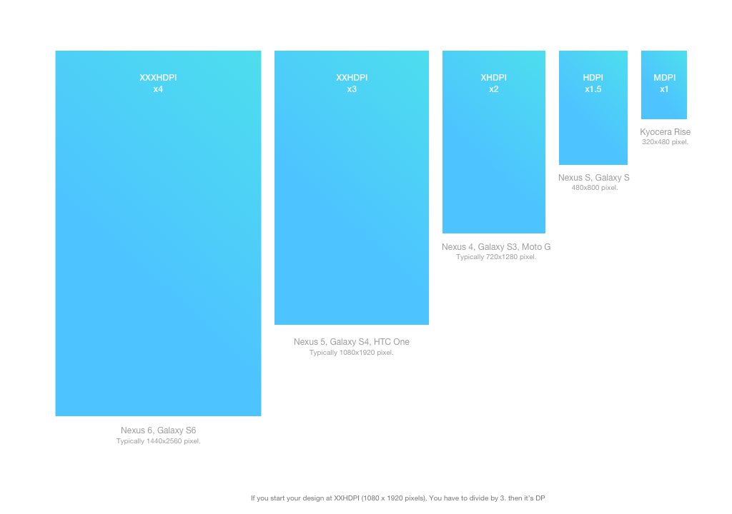
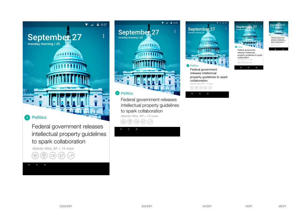
If you start your design at 1080 x 1920 pixels, you are not designing only for Nexus 5. Those spec and assets all go to all other XXHDPI phones, such as the Galaxy S4, HTC One or LG G2.
And let’s bring back DP…
Again, DP is an absolute number for any screen. To make the right amount of pixels, you have to multiply or divide by each density.
For instance, if you do a mockup at 1080 x 1920 pixels, you have to divide all pixel numbers by three and it will be DP.
Yes, you have to do some math here, so some designers just make it 320 x 480 pixels to begin with (then every number is just DP). However, I prefer to start at 1080 x 1920 pixels, because it’s the most popular size. But it’s up to you.
In any case, you should make the effort to optimize your app for different screen sizes and densities.
I recommend that you test on at least five different density devices before going live.
Interestingly, its ratio is very similar to others so you don’t have to care about the initial layout.

4. Icons
Icon style is more solid and round on the Android.

The Android drawable icon system scales up/down icon sizes automatically. However this scaling can cause artifacts in the bitmaps.
To ensure your bitmaps look their best, you should spend some time to optimize for each size.
5. Material Design
Last year, Google announced its material design, a new design language.
Without a doubt, it is a truly awesome design direction. Visit their site to understand basic UI principles.

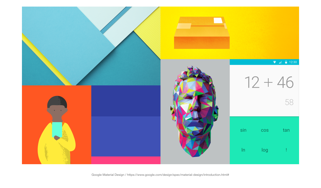
However, don’t get crazy about color and shadow like specific visual designs. You can be creative with this.
6. More Things
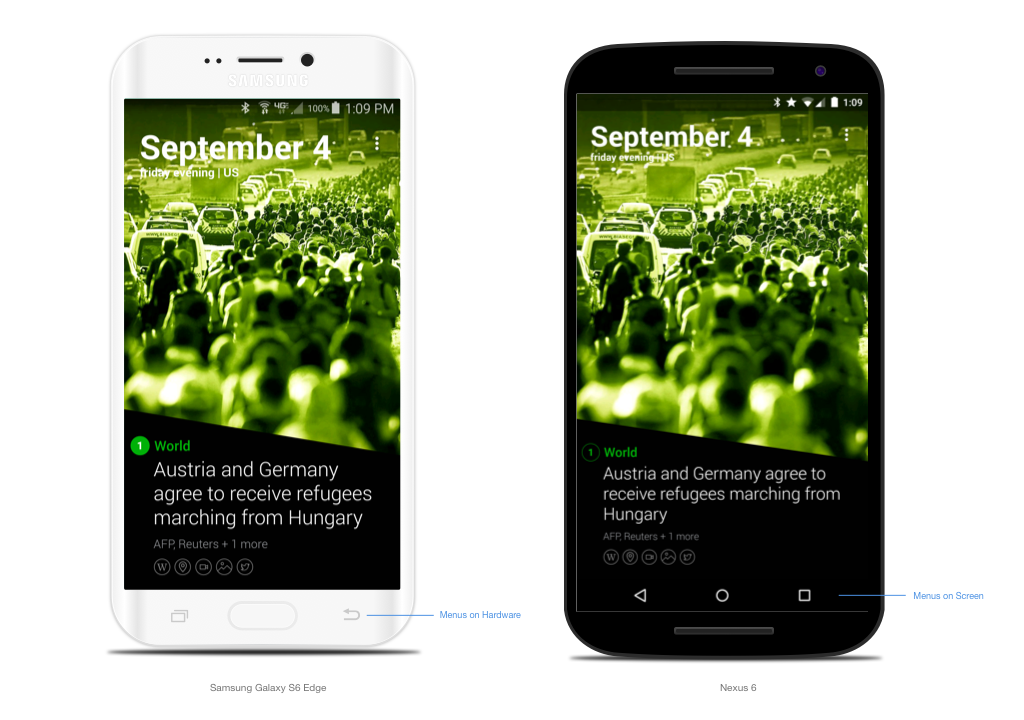
Softkey
Typical Android devices have dedicated Home, Back and Menu buttons on the screen. However, Samsung devices have those buttons on their hardware devices. It makes little difference. Make sure your layout makes sense with Samsung and others.

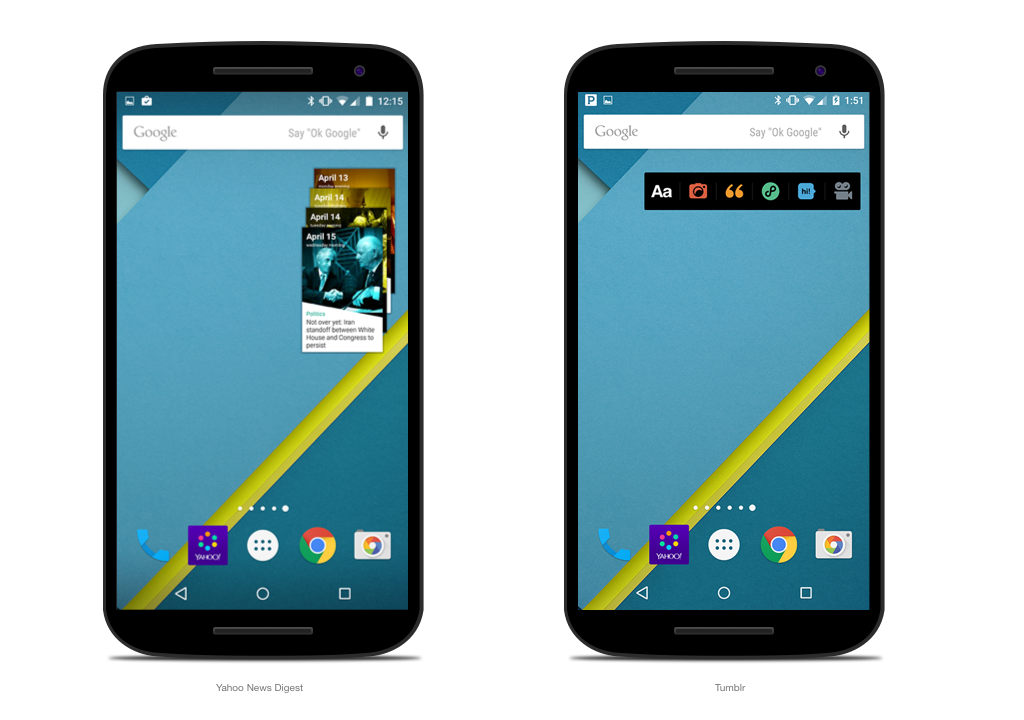
Widget
Android Widget is one of the unique features from the early version. You can create simple but useful cards on the home screen.
But it has limited features; so see how others are doing it and talk with engineers before you start to design it.

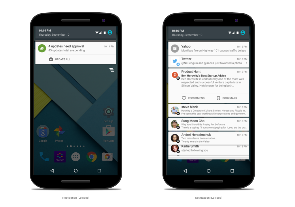
Notification
Notifications are typically icon + text or picture + text.

Again, Don’t convert. Use it for a while. It makes a huge difference.